In this Lj_biz car crash discussion,
codes had on the rate of account creation at LiveJournal. I did a quick
gnuplot chart of the result, which was pretty striking.
I decided to do a better chart as a quick project to learn gnuplot
a bit better, and ended up charting account creation rate and userbase
for what I believe are the five largest LiveJournal-based journal
sites: LiveJournal, DeadJournal, GreatestJournal, Blurty, and uJournal.
of the number of new accounts created each day:
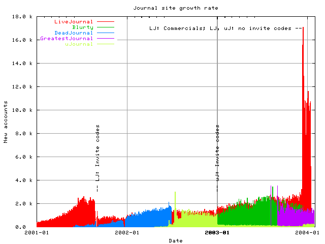
So invite codes definitely have an effect — you can see the
dramatic changes when LiveJournal introduced and removed invite codes,
and smaller but still striking changes on uJournal. (I’m not sure what
caused the drop in DeadJournal account creation halfway through
2002; I remember a dataloss issue there around then, but that shouldn’t
affect new users. Does anyone know when DeadJournal introduced invite
codes?)
One thing to keep in mind when reading the above chart is that
LiveJournal’s decision to abandon invite codes coincided exactly
(and intentionally) with the first screenings of the LiveJournal
commercials.
Some of the peak was obviously the result of moviegoers seeing those
commercials, but the level has stayed pretty high since then.
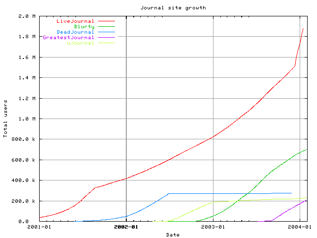
I decided that one huge inline chart was enough, but you can also
see the chart of total users per
site in the same time period (based on the number of new accounts,
which is the only archival data available). You can also see the
gnuplot
program which created the charts.
All of the data was obtained from the “newbyday” entries of the
sites’ raw
statistics. You may also enjoy reading the equivalent
human-readable
statistics.
32 responses to “Measuring LiveJournal growth”
Ok, now chart the change of how often people are actually using their journals!! =) I don’t think that has changed much, actually, where per-hour is concerned. The chart is pretty rough, right? What I find funny is that my friend gave out his LJ codes only to those that were willing to comment on his entries, and of course, to those that would actually update. Not so oddly enough, his comment stats haven’t really gone done. But he’s a good writer =P
DeadJournal introduced invite codes in mid-late 2002. I think it was within the first few months of my doing support there, and i started doing support in june 2002 i think.
I could probably a) do research, or b) ask Frank (owner of DJ, not the goat ^.^) the next time I catch him online.
Cool! You may want to post or link to this in
The first mention of invite codes I saw in New_Shit was August 10th. The data loss occured in June.
But around that time, there were lots of other server/hardware related problems that had deadjournal running very sluggishly, which probably contributed to the drop in users.
The first drop in DJ was when SCSi completely closed new account creation to prevent a flood of people from LJ over to DJ. Which was mid-afternoon on Aug 27th, 2001.
sproing
Unfortunately, historical data of active user count isn’t available — only the current number of active users (for a few values of “active”) is available in the stats page.
The chart there isn’t rough, though — it’s plotting the exact number of new accounts opened every day since 2001-01-01 on all of those sites (and the linked one, despite those smooth curves, is plotting the number of accounts created since inception for the same period.)
Or I could be misunderstanding what you mean by “rough”.
Good idea, thanks. :-)
Neat!
Tufte would kick your ass for that second chart.
Wow, cool. News to me! (We don’t do pretty stats like this….)
Well, yes, that’s why it’s not inlined. It was the first chart (save for the one you saw in Lj_biz though, and it seemed silly to discard it outright.
I’d be curious to hear what specific bits repulsed you, though :-)
Primarily the pale green/yellow on white background line. There are all kinds of minor quibbles that gnuplot does to you by default (borders, unnecessary gridlines, etc.) but they are more subjective. The yellow on white is in the “I can’t read that at all” category. :)
A little Perl and gnuplot can give you some very tidy images for canned periodic reporting. You can even wedge in fairly sophisticated curve fitting and projection without a ton of work. One of my favourite jobs as my user icon probably attests to. :)
Oh, that’s just me being lazy, since the only way I could find to tell gnuplot to stop using that awful color was to set a new X resource; despite its promise in the manual that you can specify X resources on the commandline, such that ‘gnuplot*background: color’ is expressible as ‘gnuplot -background color’, that doesn’t seem to hold for any other X resource (like, say, line5color).
I’m all about blaming the tools. :-)
Also useful for this sort of thing is rrdtool, which can be thought of as an abstracted MRTG.
If you use the png term you can set each linestyle colour in the set term statement.
I think (s)he meant hard to read… I like the totals graph better, since it shows all sites in a visible way. In the new accounts graph. I really can’t see what deadjournal did after mid 2002, where I can see from the totals graph it just stopped getting new users.
Perhaps a new accounts graph with the style of the totals? Or would that be to much lines going up and down?
Graphing discrete quantities with a line graph is bad juju.
I tried points, but there’s too much data for points to be readable (and not enough data in the big LiveJournal peak for dots to get the message across).
DeadJournal is just there for comparison anyhow, but if you want to find out exactly what happened there, the best way is to look at the source data.
why did that happen
this is fascinating, if not disconcerting. that’s an astonishing rate change. I had no idea. how does it translate into message traffic?
I wish I knew! Unfortunately, the historical postsbyday statistics on all of the sites except GreatestJournal dry up in the summer of 2003.
LJ started their use of Invite Codes, and people were going to start flooding to DJ, which couldn’t handle the influx at the time.
http://www.deadjournal.com/~medlir/2001/08/28/
that seems strange. it seems like a valuable and inexpensive metric
that makes sense.
It went away here, when you could no longer just count the posts on an unclustered installation.
I’m not sure if it was intentionally omitted for clustering, or if it was just never redone.
I was poking through the stats generation bits to find out when/why postsbyday went away, and found out that you do do pretty stats like those, just not for as long a time period (although you did use more historical data for the posts chart — it’s just out of date. Say, I bet you’re generating a new but identical post count chart nightly…).
Was postsbyday intentionally never re-implemented for log2, or was it just pulled out because there was nothing to see in log anymore and then forgotten?
not to say that there isn’t the interest… but, can that rate of growth can be maintained? i mean it seems to already be dropping a good deal. before invite codes lj seemed to be approching a non-linear curve. it will be interesting to see what sort of curve develops now.
Then where are you getting the more recent postsbyday numbers to graph?
I’m not — I’m graphing new accounts per day.
post by day count is always approximatley the same or grows slowly. that rise of accounts numer is clearly due to people creating multiple accounts.
Current mood:чукча-мыслитель
I wonder if the stats includes syndicated accounts or not…. I know I’ve created several since getting a paid account.
Also about 30% of my friends list used the end of invite codes as an excuse to get a new account.
Great graph btw (google found it for me), the overlapping is pretty illustrative for a quick hack.